

CSS Tricks - Pure CSS Animated Gradient Background and More
Let’s take a look at how to create a animated background with no Javascript and just plain CSS.
Keep your code simple & manageable, with super fast page loads leveraging Pure CSS animations.
Build a lean, mean site without the hassle and overhead of node.js, npm, react/next.js, Vercel etc.
The best code is no code at all.
- Jeff Atwood(Founder of StackOverflow)
Live Example on CodePen
Animated Gradient Background
Now let’s check out a live example on CodePen!
CodePen is an amazing free resource for developers! Check out CodePen Challenges to learn more!
See the Pen 🌈 Pure CSS Animated Gradient Background by Chris Anatalio (@anataliocs) on CodePen.
https://codepen.io/anataliocs/pen/KwdWQqB
You can build super slick features and animations for your site + blog with just Jekyll, Vanilla JS and CSS/Sass hosted on Github Pages(Like this site!)
https://github.com/hella-web3/hella-site-base
Open this site in a Github Codespace Devcontainer to check out how it works!
The CSS @keyframes rule is the secret sauce for these slick animations that don’t require a single line of JS!
Check out the CSSKeyframesRule docs for more info.
Keyframes control intermediate steps at explicitly set breakpoints in the animation sequence. These steps are also called waypoints and give more control then transitions. Learn more about declaring Keyframes here.
Keyframes Example:
@keyframes gradient {
	0% {
		background-position: 0% 50%;
	}
	50% {
		background-position: 100% 50%;
	}
	100% {
		background-position: 0% 50%;
	}
}
In this example we can see keyframes at 0%, 50% and 100% with the background-position property used to define the background image position
style for each keyframe.
As you can see, you define specific CSS styles that change over time as the animation progresses.
You can change the angle, position, color or any number of properties over the course of an animation’s duration.
Clever use of CSS functions likelinear-gradient used with ::before or ::after pseudo-elements with properties like box-shadow can create really
complex and visually dramatic effects!
This gives you an incredible amount of power and versatility in creating novel animations and interactivity that can really make your UIs that much more intuitive and just plain fun to use.
When a UI just clicks for users, it really is a joy!
Programming isn’t about what you know; it’s about what you can figure out.
- Chris Pine
It is just so intuitive, fun and powerful to create cool new effects with just plain old CSS.
Not that long ago it was a pain just to get stuff centered.

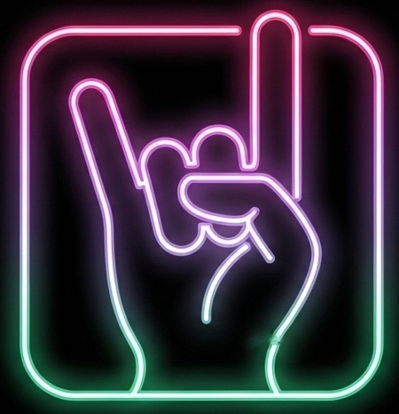
Neon Button Animations
Satisfying Unique Button Hover Animations
You have so much creative freedom to create all different types of animations and behaviors that don’t just look cool but also contribute to a intuitive UX!
In this example, for the first button, we use the :hover pseudo class along with the box-shadow property to create a simple glow mouse-over hover.
The more complex examples, leverage :before, :after, :hover:before and :hover:after pseudo elements
to create more unique effects using properties such astransition, box-shadow and background-color.
Live CodePen Example
See the Pen Neon Button Animation by Chris Anatalio (@anataliocs) on CodePen.
https://codepen.io/anataliocs/pen/ZYbKXqV
Box Shadow On-Hover Example:
.btn-1 {
  border: none;
  background-color: #ff9aff;
  box-shadow: 0 0 5px #ef97e8;
}
.btn-1:hover {
   box-shadow: 0 0 10px #ef97e8, 0 0 20px #ef97e8, 0 0 20px #fff inset;
}
The opportunities for creativity are endless!
Much More Fun then a Plain Old Spinner
Eye-Catching Loading Animations with Pure CSS
You can get super creative with really expressive loading animations.
See the Pen Neon Grid Loaders by Chris Anatalio (@anataliocs) on CodePen.
Pure CSS Simulated IDE Coding
This is probably the coolest thing I’ve seen though. Simulating an actual IDE with syntax highlighting with just CSS.
See the Pen Editor Illustration by Chris Anatalio (@anataliocs) on CodePen.
Think twice before spinning up a React app next time you have a static site to build.
I’ve been a long-time fan of Gatsby but this super lean stack has really won me over :)
Clean code is code that is easy to read, easy to understand, and easy to modify.
- Robert C. Martin(Uncle Bob)
Macbook Stickers as Dynamic Interactive Elements
At first, glance, it just looks like a img of a Macbook.
But hover over a sticker and you’ll see each one is actually a interactive element!
See the Pen Personal Concept by Chris Anatalio (@anataliocs) on CodePen.
https://codepen.io/anataliocs/pen/LEpWQNP
I hope you had as much fun as I did walking through the amazing creativity present in our OSS community <3
It’s truly never been a better time to be a developer :D
Hats off to Mozilla and the OSS community for making this stuff happen and hammering away at this stuff until they just really nail it from a developer experience standpoint. Such a joy to work with and spin up a cute, animated, responsive site in just a couple days :D
Thanks for reading! Check out more CodePen here!
What are your favorite Pure CSS animations? Let me know in the comments below!

Start the conversation